
A visitor clicks an advertisement because it promises something relevant. The landing page then presents a broad company introduction, several unrelated services and a contact form that asks for too much information. The campaign has bought attention but has not given that attention a clear destination.
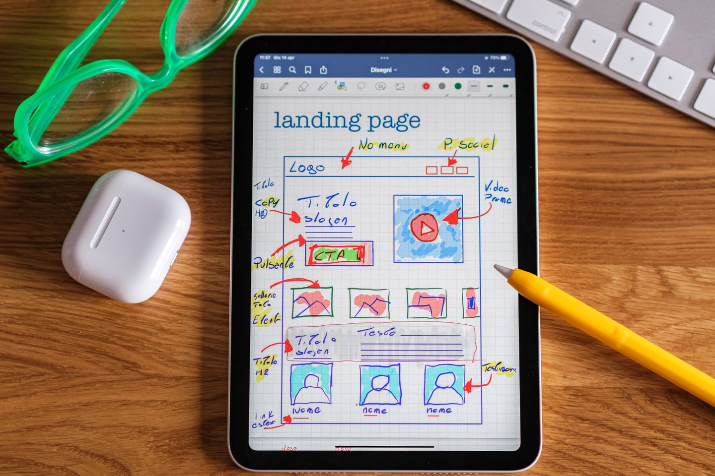
A landing page should continue the conversation started by the advertisement. Build it around one offer and one primary action, with enough evidence and detail for the intended customer to decide.
Keep the promise consistent
Use a headline that identifies the offer and the value relevant to the audience. Avoid replacing a specific advertisement with a generic slogan on the page. The visitor should immediately recognise that they have arrived in the right place.
Explain who the offer is for and what is included. Where eligibility, location, timing or capacity matters, make it visible. A page that attracts unsuitable enquiries creates work without necessarily creating opportunity.
State important conditions clearly, including what is charged separately. Do not hide the information that will predictably determine whether someone proceeds.
Answer the questions that block a decision
Use evidence appropriate to the offer: an approved example, a clear process, relevant experience or a demonstration. Place it close to the claim it supports. A row of logos cannot explain the scope of your involvement by itself.
Describe what happens after the visitor takes action. Will they receive a quotation, reserve a place, book a call or wait for an eligibility review? A precise next step reduces uncertainty and helps the team fulfil the promise.
Include concise answers to the questions the sales or support team hears repeatedly. Avoid an FAQ assembled from questions nobody has asked merely to make the page longer.
Make the form proportionate
Ask for the information needed to complete the next step. A first enquiry rarely requires the detail needed for a full project brief. More complex qualification can follow once the customer understands the service.
Use visible labels, helpful error messages and an obvious submission state. Do not rely only on placeholder text. Keep the form usable on a small screen and ensure the confirmation makes clear whether the submission succeeded.
Explain how submitted information will be used and provide the relevant privacy information. Do not silently bundle an enquiry with an unrelated ongoing marketing subscription.
Test beyond the successful path
Try an incomplete form, an invalid address, a repeated click and a slow connection. Confirm that errors preserve the information the visitor has already entered where possible.
Verify that the responsible team receives the enquiry and can identify the campaign source appropriately. Check the response template and the contact details. A form that displays “thank you” while failing to deliver the record is a serious launch defect.
Test links, phone numbers and messaging buttons on real mobile devices where available. Confirm that the destination opens correctly and that the proposed contact route is staffed.
Measure the action accurately
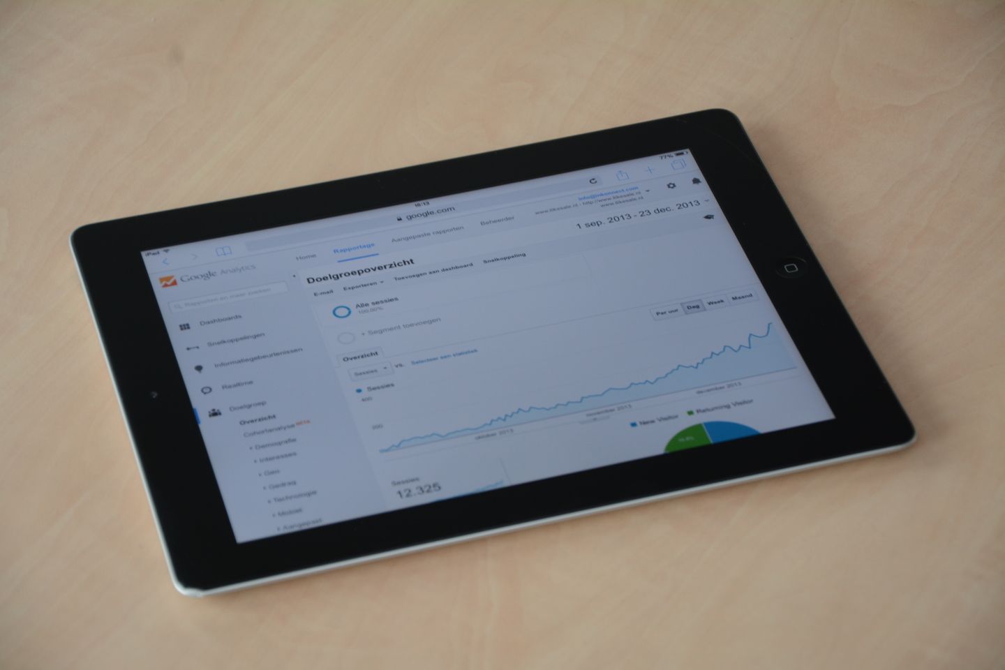
Decide which event represents success and verify it. Track a successful submission separately from a form start or button click. Keep personal information out of general analytics events and URLs.
After launch, compare the received enquiries with the target customer and the expectations created by the page. If people repeatedly misunderstand the offer, improve the explanation before increasing traffic.
Maintain a short release checklist with an owner for copy, design, functionality, measurement and follow-up. The page is ready when the entire route works, not when the visual design has been approved.
Build a campaign landing page and enquiry journey with Zero Impulse.
Reference: Google Analytics privacy and data safeguards.